So, I know a lot of you are wondering exactly what I've been doing in the past few weeks of my absence. And honestly, it was reworking my story, to the point where I decided to scrap my old story and come up with a new one. The characters are the same, but everything is on a smaller scale so 1) I can maintain my sanity, and 2) to make the story better and tighter.
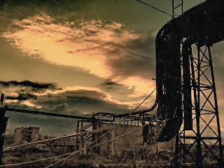
Anyways, I'm on crunch time for my midsemester review so I'm not about to spoil too much about my new story! But just to make things easier for me I'm going to post some concept photosgraphs I dug up online :)
Wednesday, December 11, 2013
Tuesday, December 10, 2013
Days of Heaven
I realize that I haven't been updating things lately, and my story has actually gone through a lot of changes pretty last minute haha, typical. So in some ways I feel like I'm back to square one, but I figure, if it's to improve my story, it's probably worth the sacrifice.
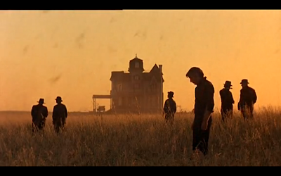
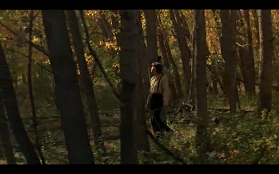
After talking to Kathy Smith, the chair of my program, she suggested that I watch the movie Days of Heaven for cinematic reference. It's really one of the most beautiful films I've seen yet, and I wish I could have seen it in HD instead of randomly streaming it. But I think the heartbreak would have been greater, because the entire film was so, so tragic. It will probably be a while before I'm brave enough to see it again, because I'm still reeling from it.
Anyways, here are some screenshots of scenes that I thought were particularly gorgeous and haunting.
My favorite shot is the one with the locusts, because the way the sequence was shot just communicates the utter sense of despair and defeat perfectly.
I know I don't usually end on a heavy note, but man. This film is one of those movies that I will be thinking of for a long time.
After talking to Kathy Smith, the chair of my program, she suggested that I watch the movie Days of Heaven for cinematic reference. It's really one of the most beautiful films I've seen yet, and I wish I could have seen it in HD instead of randomly streaming it. But I think the heartbreak would have been greater, because the entire film was so, so tragic. It will probably be a while before I'm brave enough to see it again, because I'm still reeling from it.
Anyways, here are some screenshots of scenes that I thought were particularly gorgeous and haunting.
My favorite shot is the one with the locusts, because the way the sequence was shot just communicates the utter sense of despair and defeat perfectly.
 |
| Locusts starting to rain down on the farm |
Sunday, October 13, 2013
Color tests/Composition Experiments
Lately, I've been learning a lot about composition and cinematography, thanks to a class I'm taking taught by Gil Zimmerman- the head of layout on How to Train Your Dragon 1 and 2. It's on a Friday night, and my only Friday class, so that really stinks, but judging from the material I've learned from that class I'd say it's worth the sacrifice. Before taking this class, I assumed composition was simply placing cameras and your shots in a way that looks aesthetically pleasing, but I'm starting to realize more and more that cinematography can play such a huge part in playing stories! Gil showed us this video series called Hollywood Camera Work, which used stand-still figures that slide around to show how camera angles and composition can tell a story. That blew my mind.
So anyways, I've gotten back into a streak of working really hard and I've been on a roll for this past week! Aside from studying cinematography and reading books outside of class (Framed Ink and The Filmmaker's Eye,) I've also tried to do this exercise where I crank out one digital painting in an hour. The first one took me two hours, but the last two I did in one hour, and ended up playing around with colors towards the end. I realized that my color choices are actually usually pretty crappy, because I end up wanting to use every color of the rainbow, and then everything turns really muddy, so I had to constantly go back to find references of artists like Pascal Campion who is a genius at color. I also needed to look up a bunch of films and see how they composed their shots and mimicked those shots.
 |
| testing out skies and a simpler way of painting |
p.s. side note: the above image was inspired by one of the pictures I took at the Leighton house! I wanted to capture how the sky looked and thought it would be really cool reference for the final transformation of my little town.
 |
| Reference photo for the sky |
 |
| Noemi looking out to her gloomy neighborhood |
 |
| playing with different color choices |
 |
| more colors! This is more sickly-looking and reminds me of The Backwater Gospel |
Saturday, October 12, 2013
Reference Photos
I've been volunteering at this house called the Leighton House by vermont for the past semester. Every Wednesday I would go and tutor kids with their homework and help them with their reading. For those of you who don't know, USC is in a not-very-nice place of Los Angeles, so the education of the kids that I meet in this neighborhood are way below proficiency level. It's heartbreaking because they are so eager to learn and so excited everytime they move up one grade in reading, or everytime they complete math problems that I give them. They have been calling themselves "math ninjas."
Fun fact: only 5% of the students in the public high school/middle school closest to USC are proficient in their education. (this includes the kids I teach.) Most of these kids will end up incarcerated. However, 98% students at the high school in La Canada (only 15-30 minutes away) are proficient, and most of them are above average. Sadly, the more I see of Los Angeles, the more I realize that America is not a nation founded on equality.
So this past Wednesday, I realized how similar this place was to the little slum Noemi is in. The skies were particularly incredible due to the rain, and the lighting was quite magnificent, so I decided to take some reference photos to capture the sky and the look/feel of the neighborhood. It's not your american dream neighborhood, but I love it to pieces.
 |
| check out this sky |
 |
| I really love the color variety in the houses |
 |
| check out how the sun shines through the house! |
 |
| more house designs |
 |
| I love the fences, rubble (the house next door is being redone,) and the colors of the houses against the sky |
Subscribe to:
Comments (Atom)


